Source link
This map is a anumation of Mount Saint Helen, it is computer gnerated from a more standardized map.
Saturday, November 20, 2010
DEM
Source Link
This DEM consist of a raster grid of regularly spaced elevation values that have been primarily derived from the USGS topographic map series.
Histogram
Source Link
The Histogram shown is a mathematical statement using numbers and operations, It shows the average salary verses the number of employees of companies or corporations.
The Histogram shown is a mathematical statement using numbers and operations, It shows the average salary verses the number of employees of companies or corporations.
Planimetric Map 2
Source Link
This map gives a visual of Murdock's pioneer Smethwick Gas Works is shown in Britians planimetric map of Smethwick,
This map gives a visual of Murdock's pioneer Smethwick Gas Works is shown in Britians planimetric map of Smethwick,
Cadastral Map
Source Link
This map is used for instructional purposes to show what outcome of Cadastral surveying, and the difference between cadastral surveying and cadastral mapping.
This map is used for instructional purposes to show what outcome of Cadastral surveying, and the difference between cadastral surveying and cadastral mapping.
DOQQ
Source Link
A Digital Orthophoto Quadrangle (DOQ) is a computer-generated image of an aerial photograph. This image is used to show exactly what a DOQQ is and what it looks like.
A Digital Orthophoto Quadrangle (DOQ) is a computer-generated image of an aerial photograph. This image is used to show exactly what a DOQQ is and what it looks like.
Bilateral Graph
Source Link
This map shows the comparison of two variables. It shows "Forced" Preference for Communism versus Fascism.
This map shows the comparison of two variables. It shows "Forced" Preference for Communism versus Fascism.
Saturday, November 13, 2010
Porportional Circle Map
Source Link
This map includes the number of foreign people born Irish in the Western States. The circle gets larger as the number increases.
This map includes the number of foreign people born Irish in the Western States. The circle gets larger as the number increases.
Correlation Matrix
Source Link
A correlation matrix shows the similarities of two sets of date and their dependency on one another.
A correlation matrix shows the similarities of two sets of date and their dependency on one another.
Similarity Matrix
Source Link
This similarity matrix is used for training in the TxtGate application and how to interpret its results.
This similarity matrix is used for training in the TxtGate application and how to interpret its results.
Stem and Leaf Plot
Source Link
The stem-and-leaf plot below shows the number of students enrolled in a dance class in the past 12 years.These plots are used to plot ranges of date.
The stem-and-leaf plot below shows the number of students enrolled in a dance class in the past 12 years.These plots are used to plot ranges of date.
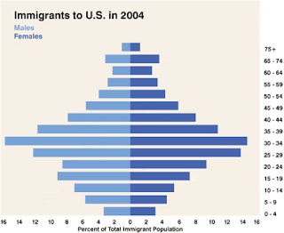
Population Profile
This population profile of recent documented immigrants to the United States shows that more than half of all immigrants entering the country are 25-39 years old, the prime working ages.
Climograph
Source Link
This Climograph is of the Boreal Region, and this is evident with the amount of precipitation in combination with the high temperatures.
This Climograph is of the Boreal Region, and this is evident with the amount of precipitation in combination with the high temperatures.
Triangular Plot
Source Link
This triangular plot shows some corrolations between the 4 samples of picked benthic foraminiferal specimens in a standard foraminiferal slide.
This triangular plot shows some corrolations between the 4 samples of picked benthic foraminiferal specimens in a standard foraminiferal slide.
Scatter Plot
Source Link
Scatter plots show the relationship between two variables by displaying data points on a two-dimensional graph.Scatter plots are especially useful when there is a large number of data points.
Scatter plots show the relationship between two variables by displaying data points on a two-dimensional graph.Scatter plots are especially useful when there is a large number of data points.
Mental Map
Source link
This is a mental or mind map. It attempts to try to show the checks and balances of ones mine. Also it demonstrated how the mind processed messages and delivers reactions.
This is a mental or mind map. It attempts to try to show the checks and balances of ones mine. Also it demonstrated how the mind processed messages and delivers reactions.
Isoline Map
Source Link
This map is a isoline map of Antarctic mean free-air gravity anomaly. It helps differentiate between heights being that Antarctica is covered in snow and ice.
This map is a isoline map of Antarctic mean free-air gravity anomaly. It helps differentiate between heights being that Antarctica is covered in snow and ice.
Subscribe to:
Comments (Atom)


