Wednesday, December 1, 2010

Bilateral Graph

Source Link

This map shows trends between three different variables spanning over a specific period of time.

Isoline Map

Source Link

This map uses isolines to show three temperature difference on a single map map. Most often heat is colored red, and moderate temperatures will be in yellow.

Star Plot

Source Link

This map is a Star plot that portrays the shapes of many star constellations.

Doppler Radar

Source Link

Doppler Radar report for New York City Metro area. It shows heavy rain in the forecast for the area.

Saturday, November 20, 2010

Cartographis Animations

Source link

This map is a anumation of Mount Saint Helen, it is computer gnerated from a more standardized map.

DEM


Source Link
This DEM consist of a raster grid of regularly spaced elevation values that have been primarily derived from the USGS topographic map series.

Histogram

Source Link

The Histogram shown is a mathematical statement using numbers and operations, It shows the average salary verses the number of employees of companies or corporations.

Index Value Plot

Source Link


This map shows the USD-Adjusted Wealth Creation in US Stock Rally.

Planimetric Map 2

Source Link


This map gives a visual of Murdock's pioneer Smethwick Gas Works is shown in Britians planimetric map of Smethwick,

Cadastral Map

Source Link

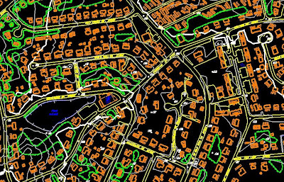
This map is used for instructional purposes to show what outcome of Cadastral surveying, and the difference between cadastral surveying and cadastral mapping.

DOQQ

Source Link

A Digital Orthophoto Quadrangle (DOQ) is a computer-generated image of an aerial photograph. This image is used to show exactly what a DOQQ is and what it looks like.

Statistical Map


Source Link

This map shows where household income has decreased the most across the United States.

Bilateral Graph

Source Link

This map shows the comparison of two variables. It shows "Forced" Preference for Communism versus Fascism.

Saturday, November 13, 2010

Porportional Circle Map

Source Link

This map includes the number of foreign people born Irish in the Western States. The circle gets larger as the number increases.

Correlation Matrix

Source Link

A correlation matrix shows the similarities of two sets of date and their dependency on one another.

Similarity Matrix

Source Link

This similarity matrix is used for training in the TxtGate application and how to interpret its results.

Stem and Leaf Plot

Source Link

The stem-and-leaf plot below shows the number of students enrolled in a dance class in the past 12 years.These plots are used to plot ranges of date.

Population Profile


This population profile of recent documented immigrants to the United States shows that more than half of all immigrants entering the country are 25-39 years old, the prime working ages.

Climograph

Source Link

This Climograph is of the Boreal Region, and this is evident with the amount of precipitation in combination with the high temperatures.

Triangular Plot

Source Link

This triangular plot shows some corrolations between the  4 samples of picked benthic foraminiferal specimens  in a standard foraminiferal slide.

Scatter Plot

Source Link

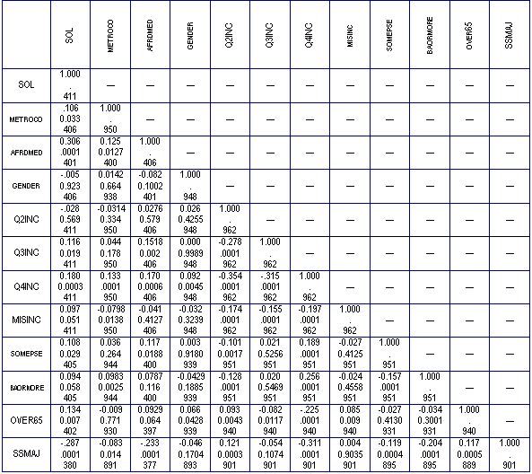
Scatter plots show the relationship between two variables by displaying data points on a two-dimensional graph.Scatter plots are especially useful when there is a large number of data points.

Mental Map

Source link

This is a mental or mind map. It attempts to try to show the checks and balances of ones mine. Also it demonstrated how the mind processed messages and delivers reactions.

Hyposometric Map

Source Link

This map is a hyposometric map of Goiania Metropolitan Region.

Isoline Map

Source Link

This map is a isoline map of Antarctic mean free-air gravity anomaly. It helps differentiate between heights being that Antarctica is covered in snow and ice.

Wednesday, October 13, 2010

Google Maps File

This map shows Grey data points that will allow viewers to see document numbers based upon location. This will allow individual documents to me looked up and read based on specific geographic information during the Earthquake in Haiti. 

Sunday, October 3, 2010

Parallel Coordinate Graph

source link

Parallel coordinates is a common way of visualizing high-dimensional geometry. This map/graph shows an example of overcoming the problem with showing data in more than 2 dimensions.

Univariate choropleth map

Source link

This map shows different household incomes for the United States. The different incomes are shown by different colors.

nominal area choropleth map

source link

This map was used in a informative blog on how different maps portray different things. This map shows the change in divorce rates between 1980 and 1990.

Thursday, September 30, 2010

Windrose map


source link

This map shows windroses for 11 secondary Pennsylvania airports. This map was constructed by Penn State University.

Cartograms

source link


This map shows Agricultural Biodiversity throughout the country.

LINDAR map


source link

This LINDAR map shows the location of Ferraro's foods in the state of Connecticut. This type map is tipically see on google maps.

PLSS MAP

Source link

This map shows the state of Minnesota broken up into quarter sections and quarter section quadrants. It also show county codes, number of government lots, government lot numbers, and acres

Wednesday, August 25, 2010

box plots

Source Link

This map is a box plot of Dawson County Nebraska. This can be found on the the property appraisers website. I have also found that other counties use these types of maps to section off different area of counties.

star plots

Source Link

This map shows objects within our galaxy that are less that 20000 light years away. The differences in color show the different types of stars. 


DLG

Source Link


This is a DLG of Topographic Map of Oregon City, Oregon to map the western lands of the United States.

DRG

Source Link

This map is actually a scanned image of a U.S. Geological Survey topographic map.

Isopleth

Source Link


This a map connecting points at which a given variable has a specified constant value. In this case the constant would be air temperature. This map would be used and an instructional map on how to read the differences between the thickness of the lines.

Isopach

Source Link

This is a map illustrating variation of thickness within a stratum. These are contour lines of equal thickness over a specified area.

Isohyets

Source Link

This map shows lines connecting points that receive equal amounts of precipitation during a given period of time

Isotachs


Source Link

This map shows lines of equal wind speed. They are most often contoured in the upper levels of the atmosphere, especially at the jet stream level.

Isobars

Source Link

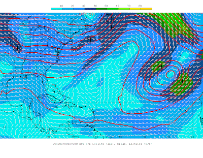
This Map depicts the differences between low and high pressure in the specified region.Air travels along the isobar lines but veering slightly toward low and away from high pressure areas.  

black and white aerial photo

Source Link

This photo/map shows Johnstown, Pennsylvania during the reconstruction phase after the great flood of 1889.

Infrared Aerial Photo

Source Link

This map shows the use of a infrared camera. This aerial photo shows a moss landing in in California known as Moffett Field.

Dot Distribution Map

Source Link

This Map shows the population distribution via the Census in the year 2000. The method used is known as the Dot method. The higher concentration of dots on the map is equal to the higher concentration of people in the state.

planimetric map

Source Link


This map shows all of the major highways throughout the state of Alabama.

Topogrphic map


Source Link 

This map shows the spacial orientation of objects as well as a scale that shows different elevations of the ground. These are mostly used for transportation projects.  The scale used in this picture is 1 inch = 100ft.

Doppler Radar


Source Link

This map shows an image of a severe hurricane over the states of Alabama, Georgia, and north west Florida.

Flow Map

Source Link

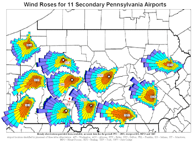
This map measures voice communication in minutes between the various countries. The amount of time (in minutes) is proportional to the thickness of the Lines.

choropleth map

This map shows the Percentage of individuals living in poverty, by county, in the United States as of the year 2000.

Sunday, August 22, 2010

World Food Consumption (Thematic Map)


Source


This map shows the daily food consumption of countries around the world.The unites of measurement are kiloCalories.