Wednesday, August 25, 2010

box plots

Source Link

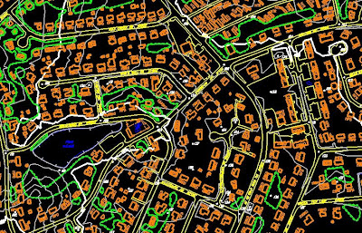
This map is a box plot of Dawson County Nebraska. This can be found on the the property appraisers website. I have also found that other counties use these types of maps to section off different area of counties.

star plots

Source Link

This map shows objects within our galaxy that are less that 20000 light years away. The differences in color show the different types of stars. 


DLG

Source Link


This is a DLG of Topographic Map of Oregon City, Oregon to map the western lands of the United States.

DRG

Source Link

This map is actually a scanned image of a U.S. Geological Survey topographic map.

Isopleth

Source Link


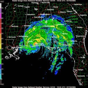
This a map connecting points at which a given variable has a specified constant value. In this case the constant would be air temperature. This map would be used and an instructional map on how to read the differences between the thickness of the lines.

Isopach

Source Link

This is a map illustrating variation of thickness within a stratum. These are contour lines of equal thickness over a specified area.

Isohyets

Source Link

This map shows lines connecting points that receive equal amounts of precipitation during a given period of time

Isotachs


Source Link

This map shows lines of equal wind speed. They are most often contoured in the upper levels of the atmosphere, especially at the jet stream level.

Isobars

Source Link

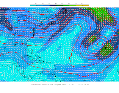
This Map depicts the differences between low and high pressure in the specified region.Air travels along the isobar lines but veering slightly toward low and away from high pressure areas.  

black and white aerial photo

Source Link

This photo/map shows Johnstown, Pennsylvania during the reconstruction phase after the great flood of 1889.

Infrared Aerial Photo

Source Link

This map shows the use of a infrared camera. This aerial photo shows a moss landing in in California known as Moffett Field.

Dot Distribution Map

Source Link

This Map shows the population distribution via the Census in the year 2000. The method used is known as the Dot method. The higher concentration of dots on the map is equal to the higher concentration of people in the state.

planimetric map

Source Link


This map shows all of the major highways throughout the state of Alabama.

Topogrphic map


Source Link 

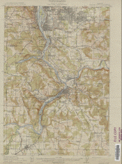
This map shows the spacial orientation of objects as well as a scale that shows different elevations of the ground. These are mostly used for transportation projects.  The scale used in this picture is 1 inch = 100ft.

Doppler Radar


Source Link

This map shows an image of a severe hurricane over the states of Alabama, Georgia, and north west Florida.

Flow Map

Source Link

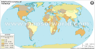
This map measures voice communication in minutes between the various countries. The amount of time (in minutes) is proportional to the thickness of the Lines.

choropleth map

This map shows the Percentage of individuals living in poverty, by county, in the United States as of the year 2000.

Sunday, August 22, 2010

World Food Consumption (Thematic Map)


Source


This map shows the daily food consumption of countries around the world.The unites of measurement are kiloCalories.